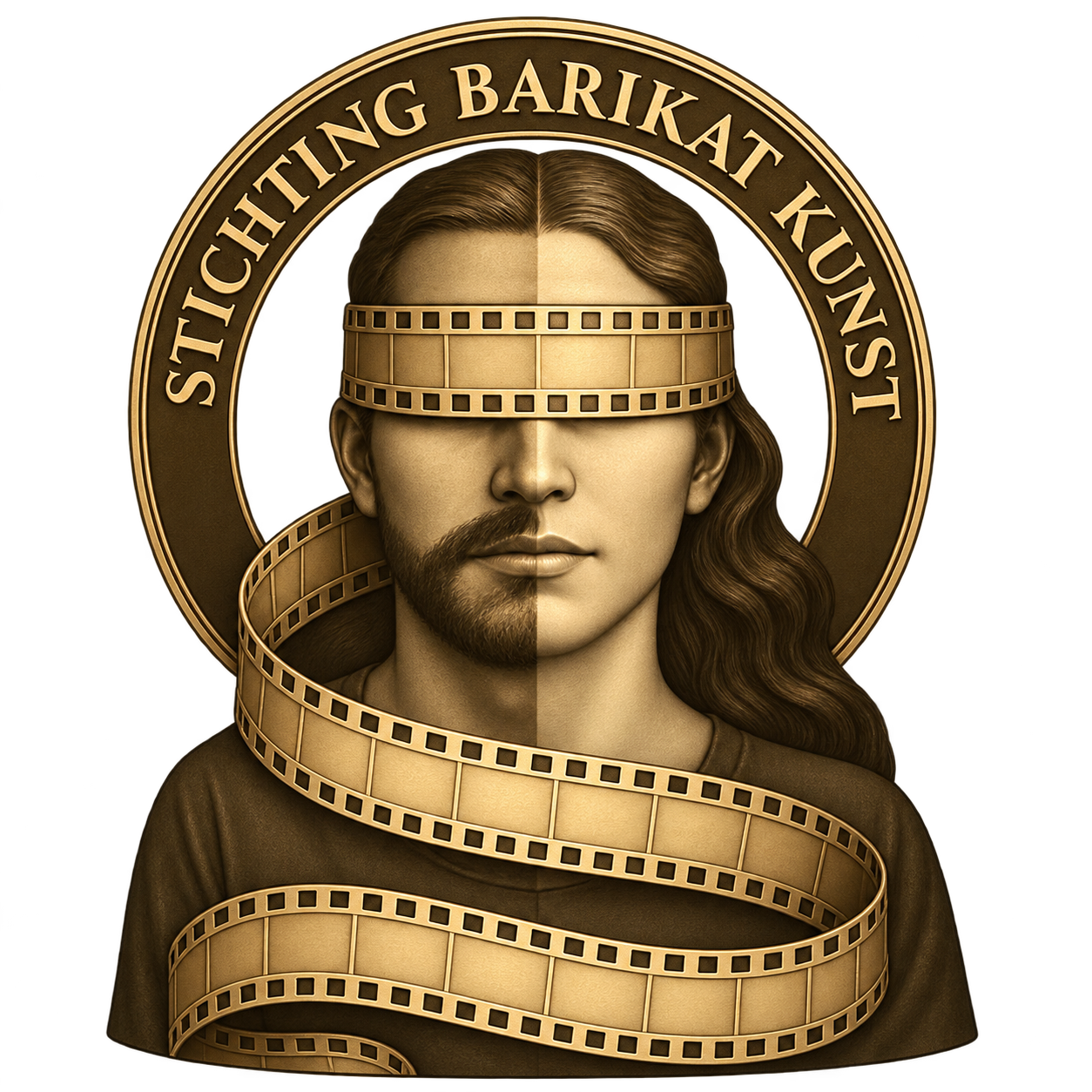
Foundation logo
The golden emblem is the foundation’s main logo. Keep its original colours, lettering and proportions. The official name, Stichting Barikat Kunst, is not translated.
Campaign image
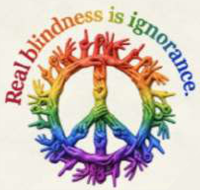
The colourful circle of people represents the festival campaign. It complements the foundation logo and does not replace it. Keep the original artwork and wording intact.
Our colours
Dutch orange
#EF8034Deep petrol
#17343DWarm cream
#FBF8F2Dark orange
#984014White
#FFFFFF
Space, size and backgrounds
Leave clear space of at least one quarter of the logo’s width on every side. Recommended minimum width: 96 px on screen and 25 mm in print. Below this size, use the foundation’s name as text.
Use a plain white, cream or dark petrol background. Keep the complete emblem visible; do not recolour, stretch, rotate, crop or add effects. Use the original high-resolution PNG for print.
Correct and incorrect use
Name, slogan and typography
Use Manrope for digital body text and Georgia for display headings, with legible local-script fallbacks. Keep the logo’s own lettering unchanged. Use the slogan in the publication’s language, as shown below.
We dream of a world without barricades!
Accessible communication
For text, aim for at least 4.5:1 contrast, or 3:1 for large text. Orange is an accent; use deep petrol or dark orange for readable text on light backgrounds.
Publish names, dates, venues and essential information as selectable text. Describe informative images and do not communicate meaning through colour alone.
Press and shared publications
For joint layouts, campaign files or larger print formats, contact the foundation before production. Agree the placement of partner logos and the description of each organisation’s role.